Watching NYC Subways Shut Down
March 30, 2020
Like a lot of people, I’ve been obsessively tracking the spread of COVID-19 through graphs rapidly moving up and to the right. So, to mix things up, here’s a new way to track the impact of the pandemic through graphs that are going down with MTA turnstile data. Each week, the MTA publishes a data dump of entry counters for every subway turnstile. I used this to measure the decrease in people movement over the last few weeks in New York City. When exactly did people start adjusting their behavior? Where has movement decreased the most?
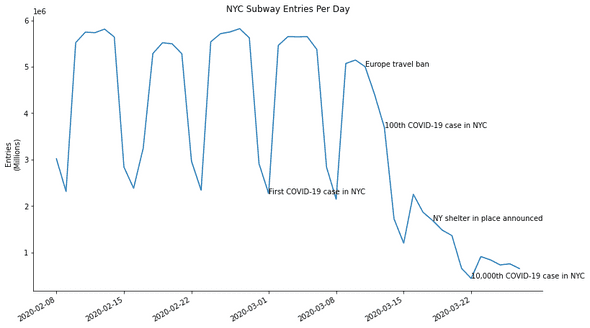
The week of March 8th was when things started to get weird. I remember it feeling like a very anxious, confused, in-between time. At the beginning of the week it was clear something big was going to happen, but the imagined scenarios seemed hard to reconcile with what was still mostly normal day to day life. Just one week prior, the first case in New York City was confirmed and people were still commuting as normal. March 8th was the week where each day brought a new retreat from normal life and people started to get serious about adjusting their behaviors.
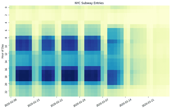
From Monday, March 9th to Wednesday, March 11th, there’s a marked decreased in subway volume, and also a change in its distribution. Morning/afternoon peak commute periods are diminished but still visible. But just outside of peak hours, from 6-7am and 10-11pm, there’s actually an increase in the number of people entering the subways. Perhaps people were scrambling to stock up on supplies before and after work?
After March 12th, subway usage plummets. In the most recent week of published data, March 21st to March 27th, subway ridership has decreased 85% compared to normal weeks.
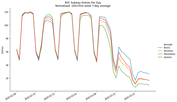
The above graph breaks out subway ridership by borough, but to better visualize the relative changes numbers have been normalized to the volume of a “typical” pre-coronavirus week. Every area of New York has had a major decrease in people movement, but that effect has been largest in Manhattan and smallest in the Bronx.
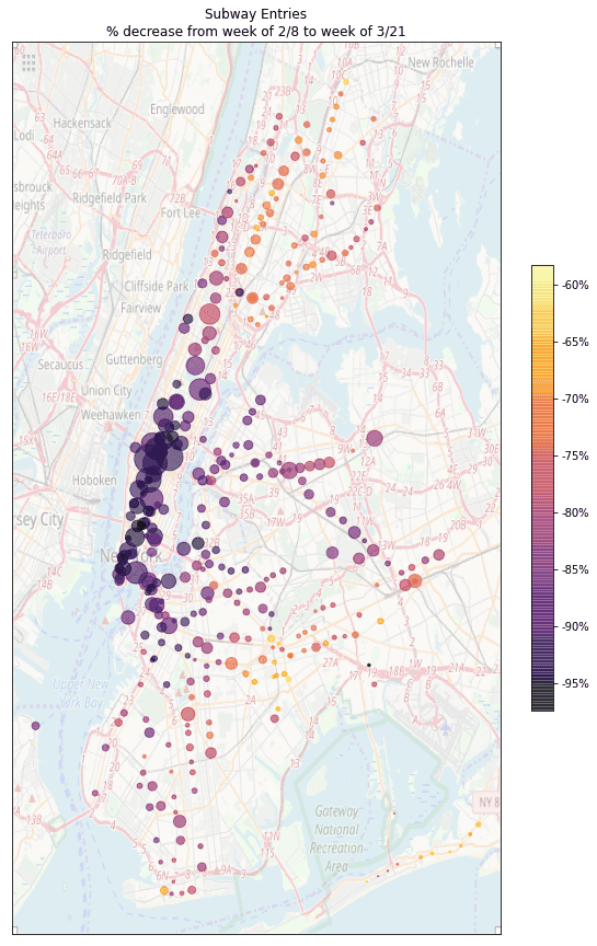
The map below visualizes the relative changes in ridership per subway station. Darker colors have a larger decline in subway entries, and dot size is an indicator of pre-coronavirus volume. Subway travel in midtown and downtown Manhattan has all but evaporated as people have stopped commuting to work. There seem to be some clusters of relatively less decrease around Brownsville in Brooklyn and the 4/D lines in the Bronx. Does this say something about who still has to take the subway and show up to work?
Eventually, once shelter in place and social distancing starts to relax, it will be interesting to revisit this analysis and see which areas start to reactivate first.


